2024-03-28 by Evrim Öztamur
Generating Excel’s What-if Analysis Data Tables in Python
I am a part-time corporate valuation specialist, which means that I put prices on things, and spend nearly all my billable hours in Excel. One particularly useful toolkit in Excel is the ‘What-if Analysis’. In particular, the ‘Data Table’ tool.
This tool can be used to build scenario analyses for many kinds of situations, my particular one being the conversion of potential startup exit scenarios into liquidation waterfalls.
I’ve been meaning to automate a large part of my workflow, as I usually do, but dealing with the tax authorities and other financial services firms or clients means that I have to remain in Excel land. As I was researching ways to codify my processes in Python, one snag that I hit was setting up these data/scenario analysis tables. I genuinely spent hours trying to get some kind of lead on it, but the only option I found was a proprietary tool. However, I wasn’t planning on giving up so quickly.
Before I start going further into the technical details, I would like to introduce data tables to show you what our goalpost for this post is.
By the end, you should be familiar with the process of making scenario analyses in Excel, get a better understanding of some of openpyxl’s warts (including its API documentation), and finally be able to automatically generate these analyses via Python.
Scenario Analyses with Excel
Imagine any ‘scenario’ where we have two independent variables which impact the rest of our Excel sheet in various ways. Other formulas take them for inputs, and we cannot analytically resolve the outcome of our computations because of conditional flows (very common in liquidatation preference calculations). We also don’t want to pre-compute everything, because a big benefit of using Excel is that it provides interactivity. With a sheet that takes custom inputs, people can play around with these inputs and get results immediately.
Let’s imagine a simpler one, like the following:
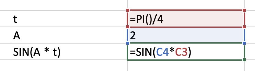
Here, we have t, a real independent variable, and A, which is the angular frequency. Our scenario outcome is sin(A * t), or =SIN(C4*C3) in Excel formula language.
We would like to observe what happens to this outcome when we change A and t, and create a 2-dimensional plot. Although this is a very simple scenario where we could simply create a table manually and fill in the formulas by dragging the little knob at the bottom right corner of our selection (you must watch this video by an Excel-lent man), we already decided that we will be using our powers for more complex analyses. For now, plenty enough.
We continue by setting up a little section of our sheet with some inputs and outputs (I styled it a little bit for clarity):
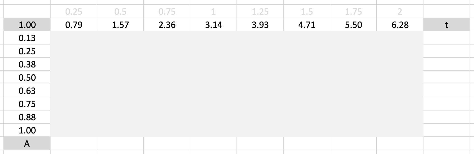
The top row is our ‘row input’, I put a little t in there to remind us which variable it is. The leftmost column is the ‘column input’, A. At the top-left cell, where it notes 1.00, is our result formula cell. The formula value of this cell, which can be a reference to any other cell or a regular formula, will be used to populate the cells in the gray zone.
What Excel does is essentially run our whole worksheet as if it was a function. It will for each pair of inputs supply the row and column inputs to the row and column input cells we declare in our data table as arguments, and populate the corresponding result cell with the value of our result formula cell.
For the row input I specified t as =PI()*{0.25, 0.5, ..., 2.0}. It’s a spreadsheet, you can structure it in any weird way you want. For the column input I specified A as {0.125, 0.25, ..., 1.0}.
We now apply magic. Select the region from the result formula cell to the end of our gray zone:
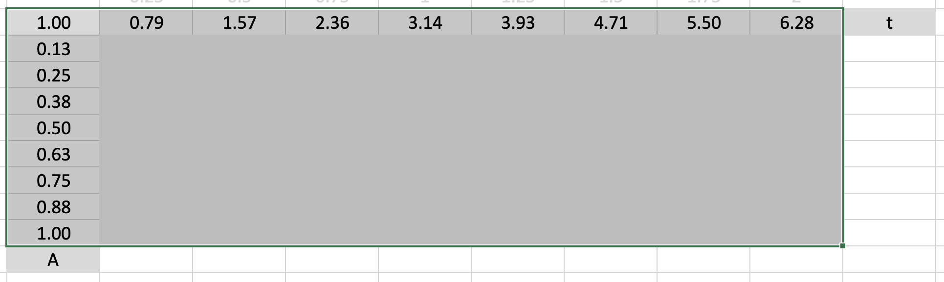
Go to Data → What-if Analysis → Data Table and fill our row and column input cells with C3 and C4 respectively. Ta-daa!
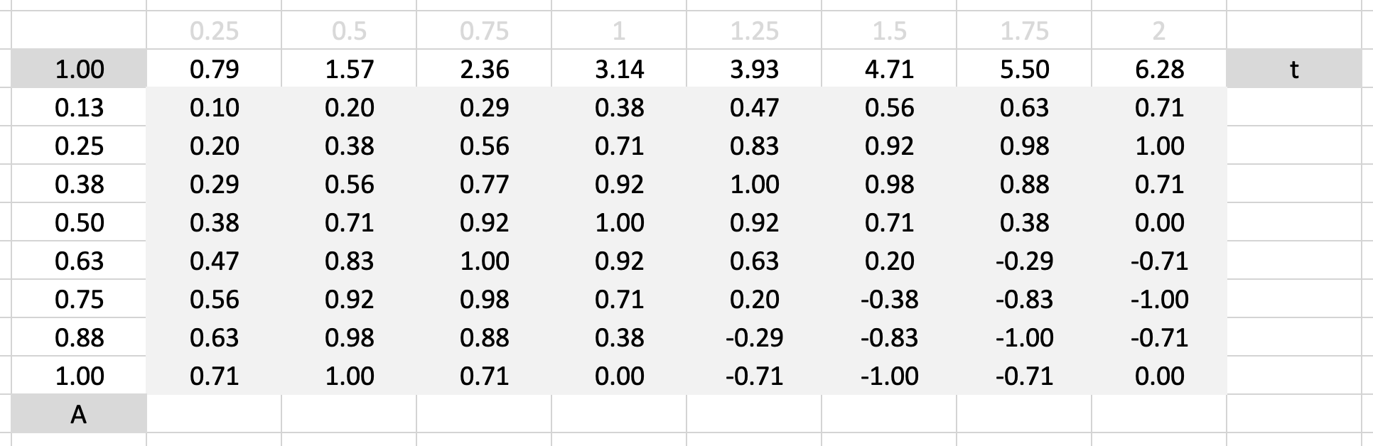
We now know what our result formula evaluates to for all these pairs of A and t. Handy!
Let’s make it a little pretty too by using the conditional formatting color scale option for extra class:
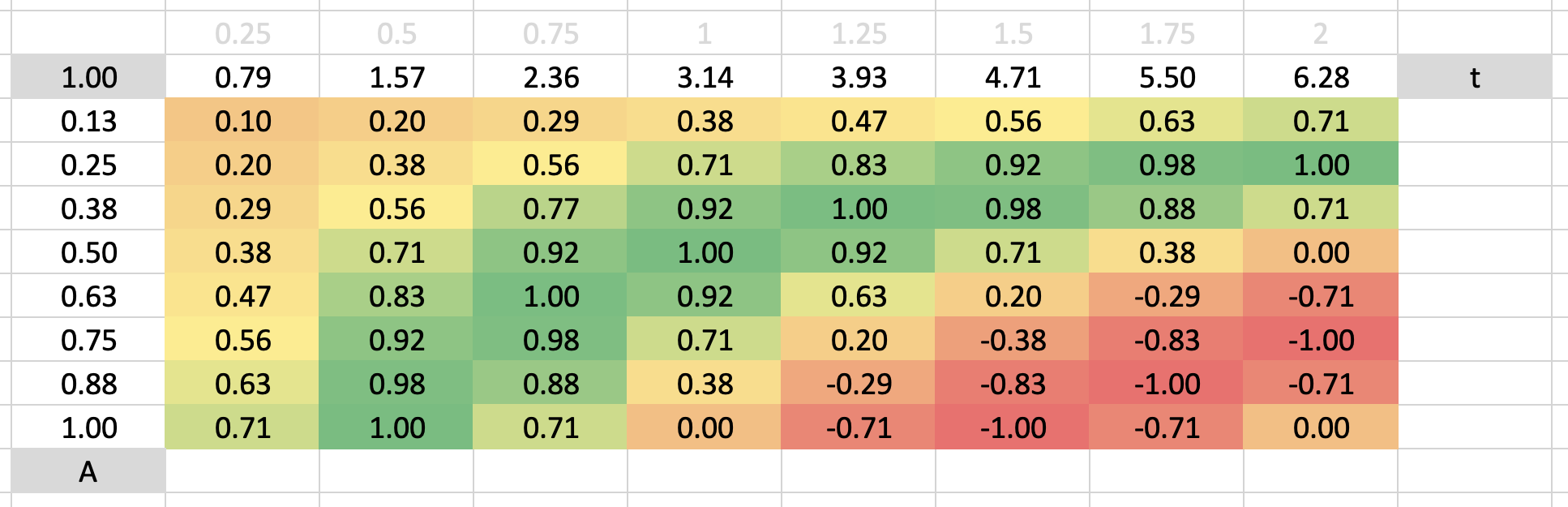
Like a parakeet in heat! We know how Excel fills in these cells, but what happens when you save the file? Can we create data tables programmatically? Do we really have to click buttons for this? Let’s find out.
How are data tables encoded in .xlsx files?
Again, I spent way too much time with no leads, and actually gave up on this project for a couple of months. Googling endlessly various documentation and code samples, I had no leads whatsoever.
Next, I did what any reasonable programmer in the 21st century would do, and asked ChatGPT…
ChatGPT, what is a data table?
I went ahead and asked it what the Open Office XML structure for Excel’s what-if analysis components are.
Upon doing so, it gave me a seemingly-correct (!) breakdown of the three options, data tables, scenario manager, and goal seek. Only the first one is relevant for today:
Data tables are represented within the
<worksheet>element, utilizing<table>tags to define the table and its attributes, including input and output cells.
That seems reasonable, let’s see what the <table> tag actually is via the Microsoft OOXML documentation:
This element is the root element for a table that is not a single cell XML table.
Right… that doesn’t look like what I’m looking for, but maybe that’s really the internal representation? It could just be that my prompt is bad and it got confused.
Oh, ChatGPT, what does a 1/2-variable data table look like in XML?
1-Variable Data Table XML Structure
<tableParts count="1">
  <tablePart r:id="rId1"/>
</tableParts>
This snippet indicates a relationship to a table part within the workbook. The actual data table configuration would be detailed within the table definition part referenced by
rId1.
However, the specifics such as input cell reference, row/column input, and the area covered by the data table are not directly visible in this simplified example. These details would be specified in the worksheet part that contains the data table, and possibly in a defined names (
definedNames) section if the data table uses named ranges.
Alright, interesting, it seems like Excel is storing some more complex structure than I initially thought. When you take a look at the formula in Excel, it just says =TABLE(C3,C4), so maybe there’s something to it.
It gave me the brilliant suggestion to just open up the .xlsx file and take a look at it, so I used the OOXML Viewer extension for VS Code to explore what’s going on.
Actual explanation by forensic work
Well, spoiler alert, ChatGPT was confidently bullshitting. It’s literally one line:
<c r="F4" s="3">
    <f t="dataTable" ref="F4:M11" dt2D="1" dtr="1" r1="C3" r2="C4"/>
    <v>9.80...</v>
</c>
This is a regular formula declaration for a cell, denoted with the element <c>. <v/> is the computed value that Excel caches to avoid recomputing the workbook each time you open it, and <f/> is the formula declaration. I realised in turn where it all went wrong. When you search for ‘datatable’ in the documentation, you get:
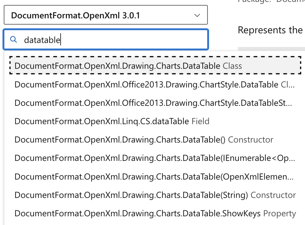
Which is not what I wanted! However, searching for dt2D (data table 2D), gives me a bit more information. This XML attribute “corresponds to the following strongly-typed properties: CellFormula.DataTable2D.” Bingo.
Unless there are some crazy metadata magic going on (like ChatGPT was rambling about), the process of getting data tables in with Python should be a lot easier than I thought!
The red herring
As I was looking into how I could get this set up through openpyxl, or if it was even possible, I decided to Google, for the sixth time (?) “dataTable openpyxl” and naturally failed in the same way:
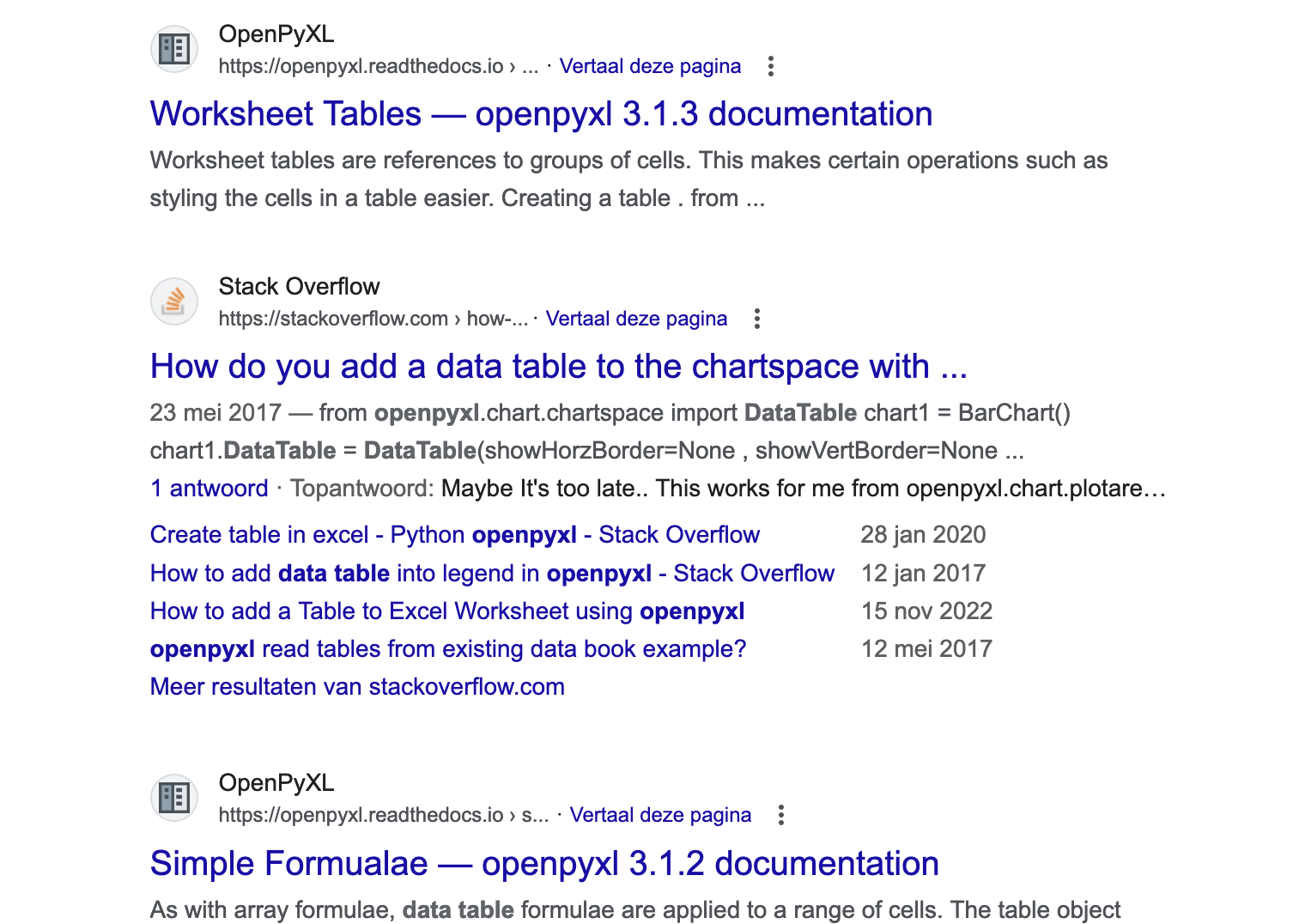
Yeah, people are talking about a different kind of data table, which is a table of data. Makes sense, but I saw this result before already!
Hold on… ‘simple formulae’ huh? Why did that page show up, data tables are simple after all!?
Data Table Formulae
As with array formulae, data table formulae are applied to a range of cells. The table object themselves contain no formulae but only the definition of table: the cells covered and whether it is one dimensional or not, etc. For further information refer to the OOXML specification.
I was… just at the OOXML specification… digging for this! Ugh, in a terribly-named page, there’s a subheading called ‘special formulae,’ which has this beautiful line:
Openpyxl also supports two special kinds of formulae: Array Formulae and Data Table Formulae. Given the frequent use of “data tables” within OOXML the latter are particularly confusing.
Yes, particularly confusing. What I was even further frustrated by was that after spending all this time, I didn’t even really find documentation on how to use this with openpyxl. Luckily, it didn’t take much time.
Tools of the trade
I decided to quickly figure out how to use openpyxl and get the formulas in.
from openpyxl import Workbook

wb = Workbook()
ws = wb.active
Let’s set up our worksheet like the example we went through before:
ws['B3'] = 't' # Position on the sine wave
ws['C3'] = 0.0

ws['B4'] = 'A' # Amplitude of the sine wave
ws['C4'] = 0.0
openpyxl is a bit weak in terms of its functionality, it’s a bit “raw” if you will. However, some script kiddy code saves us. As we cannot use the R1C1 notation with OOXML (might also be an issue with my code or openpyxl, cannot tell), I wrote a little function to convert (row, column) into the alphanumeric “C5” notation:
from openpyxl.utils import get_column_letter

def pos_to_coord(row_index, column_index):
    return f"{get_column_letter(column_index)}{row_index}"
Using this, we can set up our inputs for the table:
# Table inputs
for i in range(0, 8):
    column = 6 + i # Real column position for values of `t`
    ws.cell(2, column, value=0.25 + i * 0.25) # 0.25 -> 2.00 on R2
    ws.cell(3, column, value=f"=PI()*{pos_to_coord(2, column)}") # =PI * R[-1]C on R3

    row = 4 + i # Real row position for values of `A`
    ws.cell(row, 5, value=0.125 + i * 0.125) # 0.125 -> 1.00 on C5

# Data table result cell
ws['E3'] = "=SIN(C4 * C3)" # =SIN(A * t)
Once again, in the original file, the data table declaration looks like the following:
<c r="F4" s="3">
    <f t="dataTable" ref="F4:M11" dt2D="1" dtr="1" r1="C3" r2="C4"/>
    <v>9.80...</v>
</c>
DataTableFormula takes the same arguments as the function declaration above. This class is a simple object with t = "dataTable", and it seems like openpyxl converts it to the <f/> element as-is.
from openpyxl.worksheet.formula import DataTableFormula

ws['F4'] = DataTableFormula(ref="F4:M11", dt2D=True, dtr=True, r1="C3", r2="C4")
For some extra flair, we can also use some more openpyxl functionality to juice the data table for real:
from openpyxl.formatting.rule import ColorScaleRule

# We can use the ColorScaleRule to get the same visual effect as the example
ws.conditional_formatting.add('F4:M11',
    ColorScaleRule(start_type='min', start_color='F8696B',
                   mid_type='percentile', mid_value=50, mid_color='FFEB84',
                   end_type='max', end_color='63BE7B'))

# Iterating over the numbers we put down, we set the number format to be a bit nicer
for row in range(2, 12):
    for col in range(5, 14):
        ws.cell(row, col).number_format = "0.00"
Conclusion
And here we go!
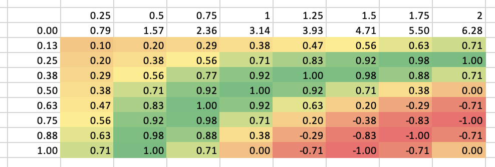
It actually works exactly as the initial example. I am fascinated for some reason, but that’s probably because I spent too much time being misled by the horrible nomenclature behind one of the more useful features of Excel.
I wish to contribute to the openpyxl documentation to bring in a little more clarity to this feature. I see it being used quite frequently in my industry, and it is genuinely hard to find any information on how to set this up. In case I missed some obvious results on the Google hunt, my apologies for this lengthy blog post.
I’m looking forward to incorporating this feature into a more complex automation pipeline for valuations. Until then, I have some valuation models to prepare…
A lawyer dies and demands audience with the Lord right away.
— Lord, why did I have to die so young at 45, in the prime of my life?!
— Hmm, let me check our records, what’s your name, John Smith? … John Smith … here it is! You say you are only 45? According to your billable hours you are past 112!