2023-01-31 by Evrim Öztamur
Journal timelines
While digging around for some research on journal systems, I found these great visualisations on the beancount docs:
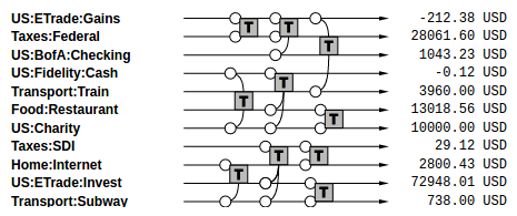
This graph displays transactions on a timeline where each transaction has arms reaching out to the accounts they impact. This could be a very useful as an appendix to various reports generated by accotron. I will look into how the SVGs are generated, but conceptually simple enough! Amending with hyperlinks to the underlying journals would be very useful too.
The problems with this style of representation on the other hand are:
- Transactions are very close together and are hard to distinguish:
- The arms reaching out to the accounts are to link the transactions to the accounts they impact, but it’s visually cluttered.
- The order of the transactions is hard to tell as well, with interleaved transactions set apart only a few pixels wide.
- Impact of the transactions is also unclear, with no sign of the movement direction available.
Improving the beancount visualisation
In order to solve these, I made several changes:
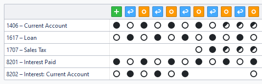
- Journals are clearly separated by columns.
- Annotations for each transaction are shown.
- Arms linking journals are removed.
- With a columnar alignment, they are no longer necessary.
- This uses more horizontal space, but the trade-off is worth it.
- Impact of the journal is clarified by symbols on each line:
- A filled circle is a debit entry.
- An empty circle is a credit entry.
- A crossed-through circle has both types of entries for that account.
With all these adjustments put together, I think that the result is much easier to track:
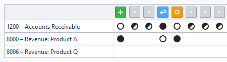
It is now easier to (in this example, for the chain of a single resource) track the adjustments made. You can tell the semantic meaning of a reversal, and also notice major changes like added or removed accounts at a glance.
The annotation icons for the journals share the same design language with the rest of the application, and they also contain hyperlinks to the journals for easier navigation.
All in all, I think that this timeline format keeps the idea while improving on it with all the new metadata we have. Further improvements can be made to visualise changes in other properties, such as the date of the journal, or movements in tax rates etc.